Squash those nerves with some guidelines for your session
1 3
2 3
3 3
Dress to impress
To color or not to color
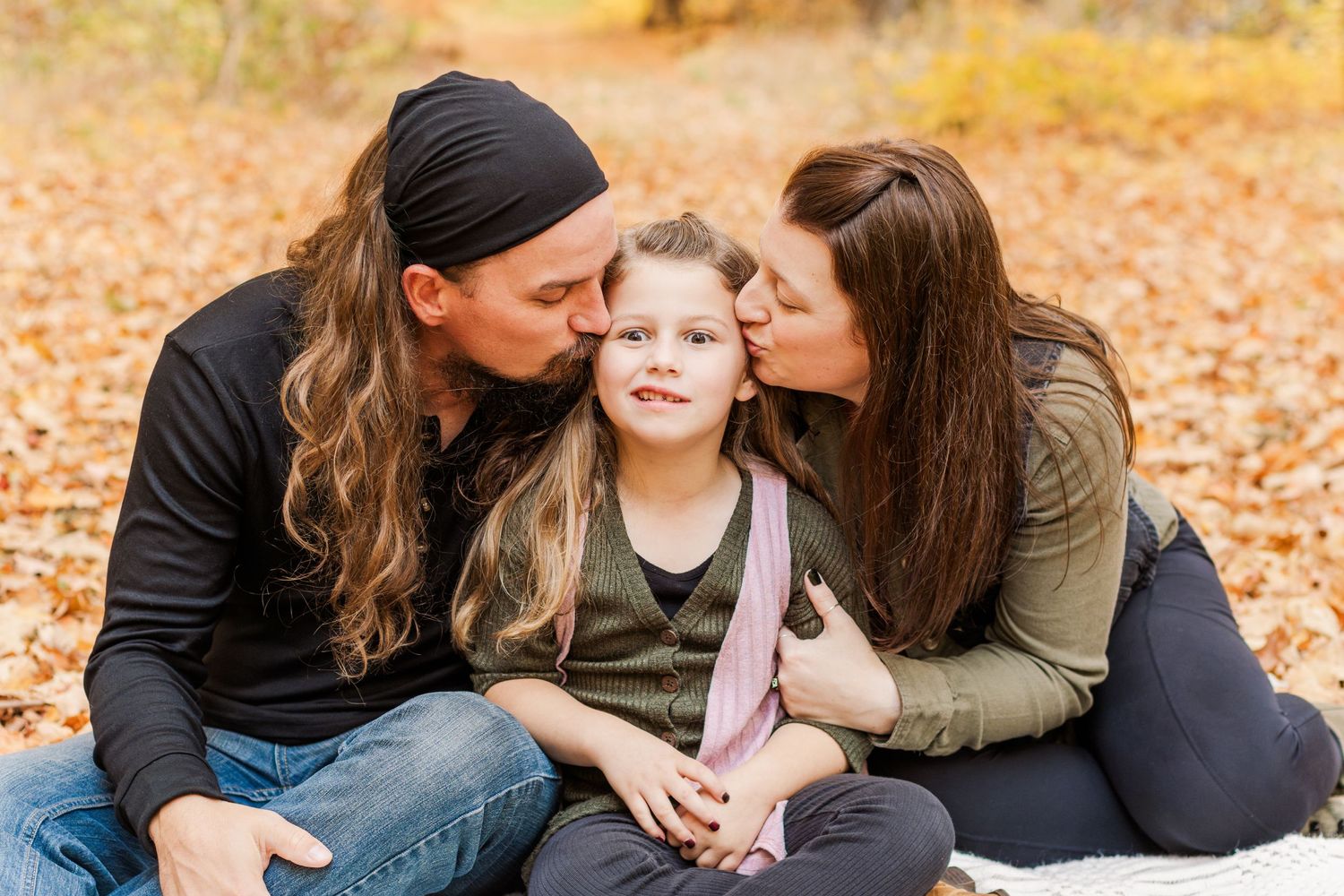
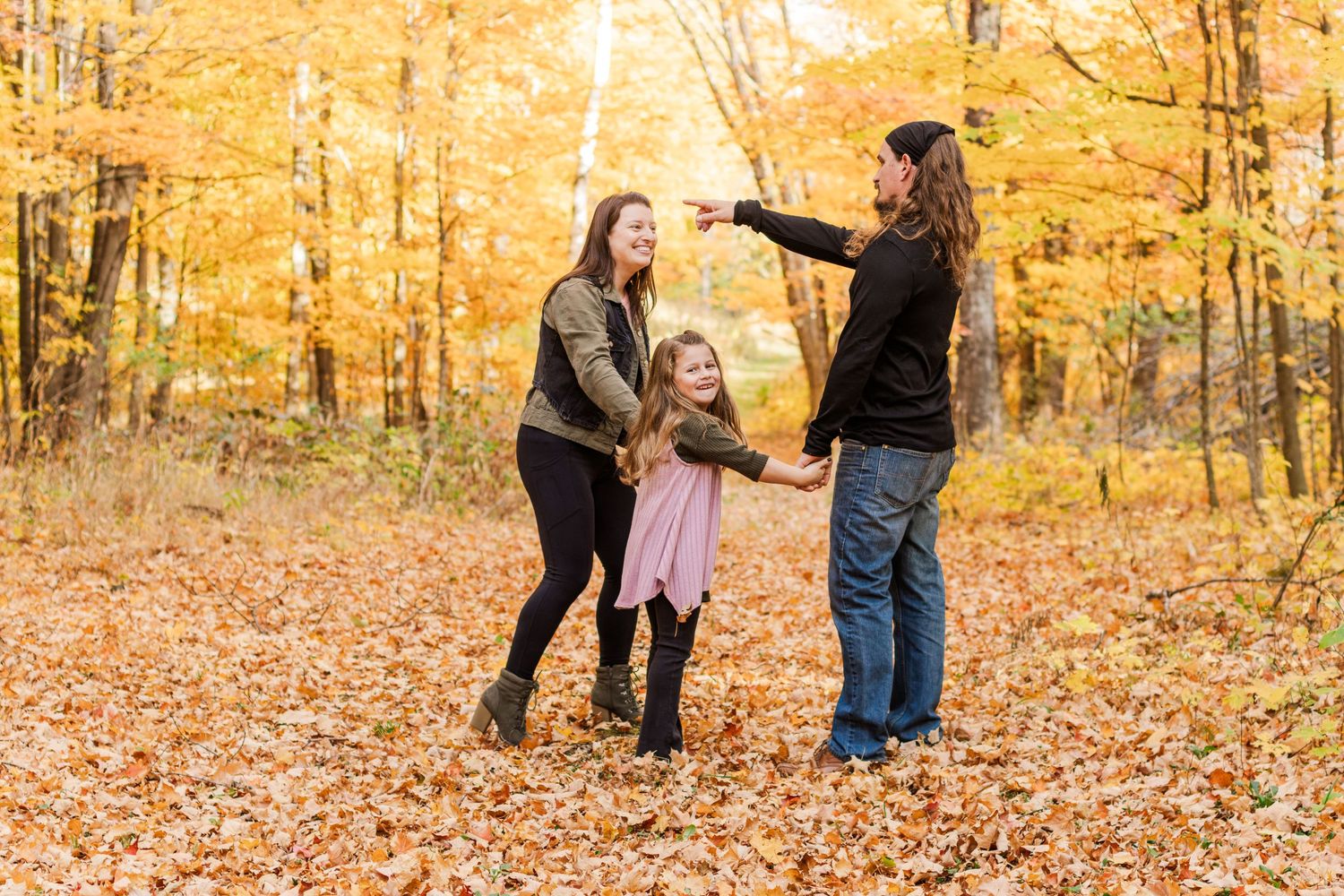
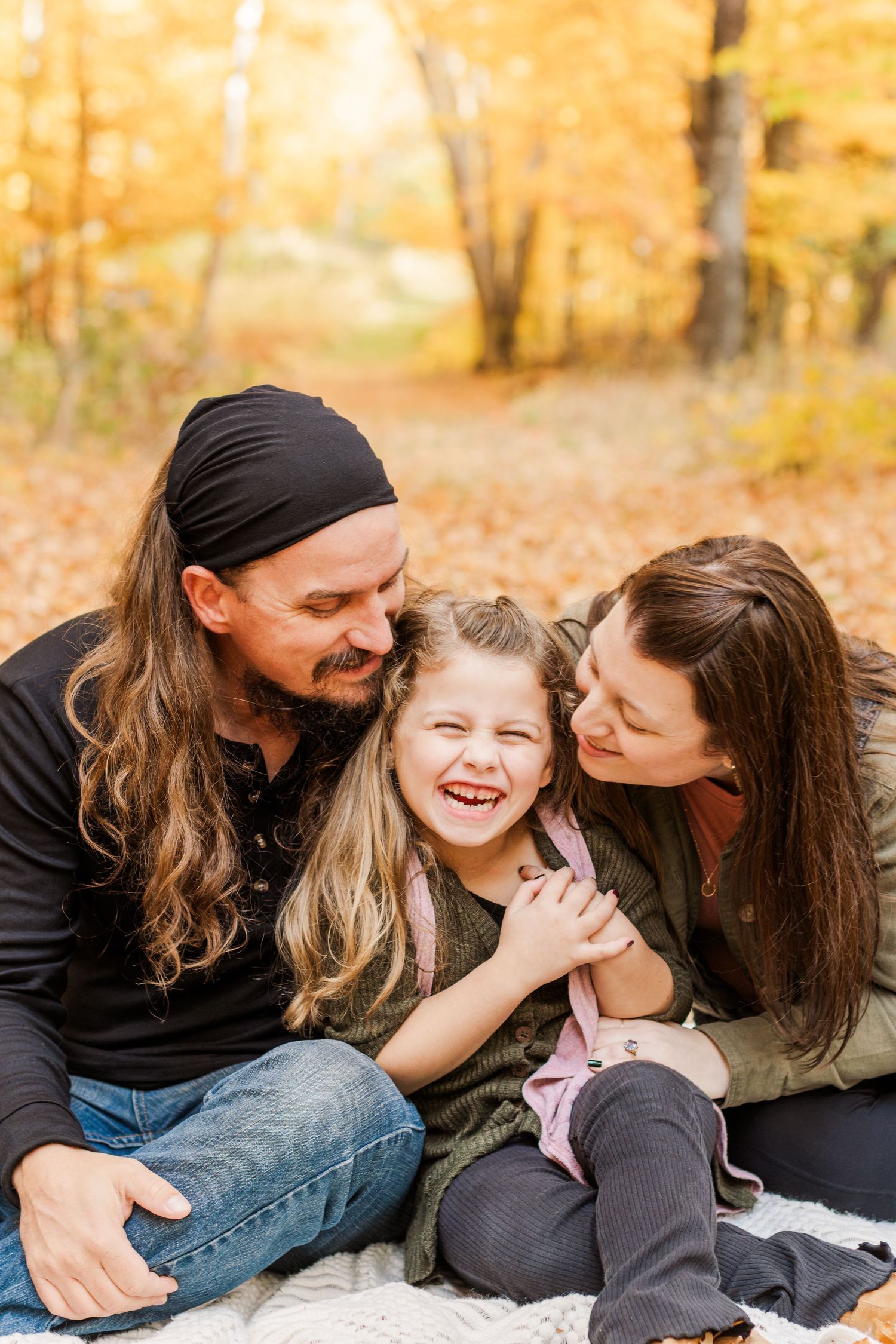
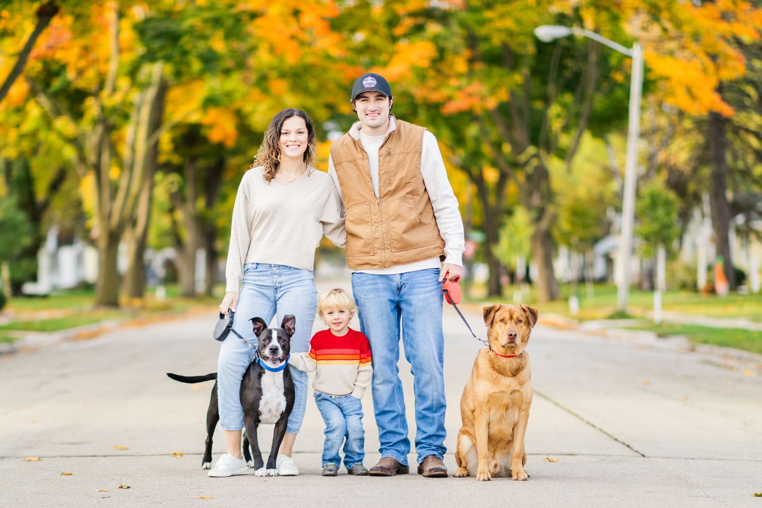
Regardless of the weather, the tones of color you choose to wear make a big impact on your photos. Neutrals, earth tones, and most pastels are always a safe option for photos; however, a little color never hurt anybody. Don't be afraid to add a pop of color to a more neutral scheme. There are some colors that should be avoided or used carefully such as black, bright red, neon, bright white, and bright blue. These colors can greatly alter skin tones and moods of photos or will appear unnatural in photos.
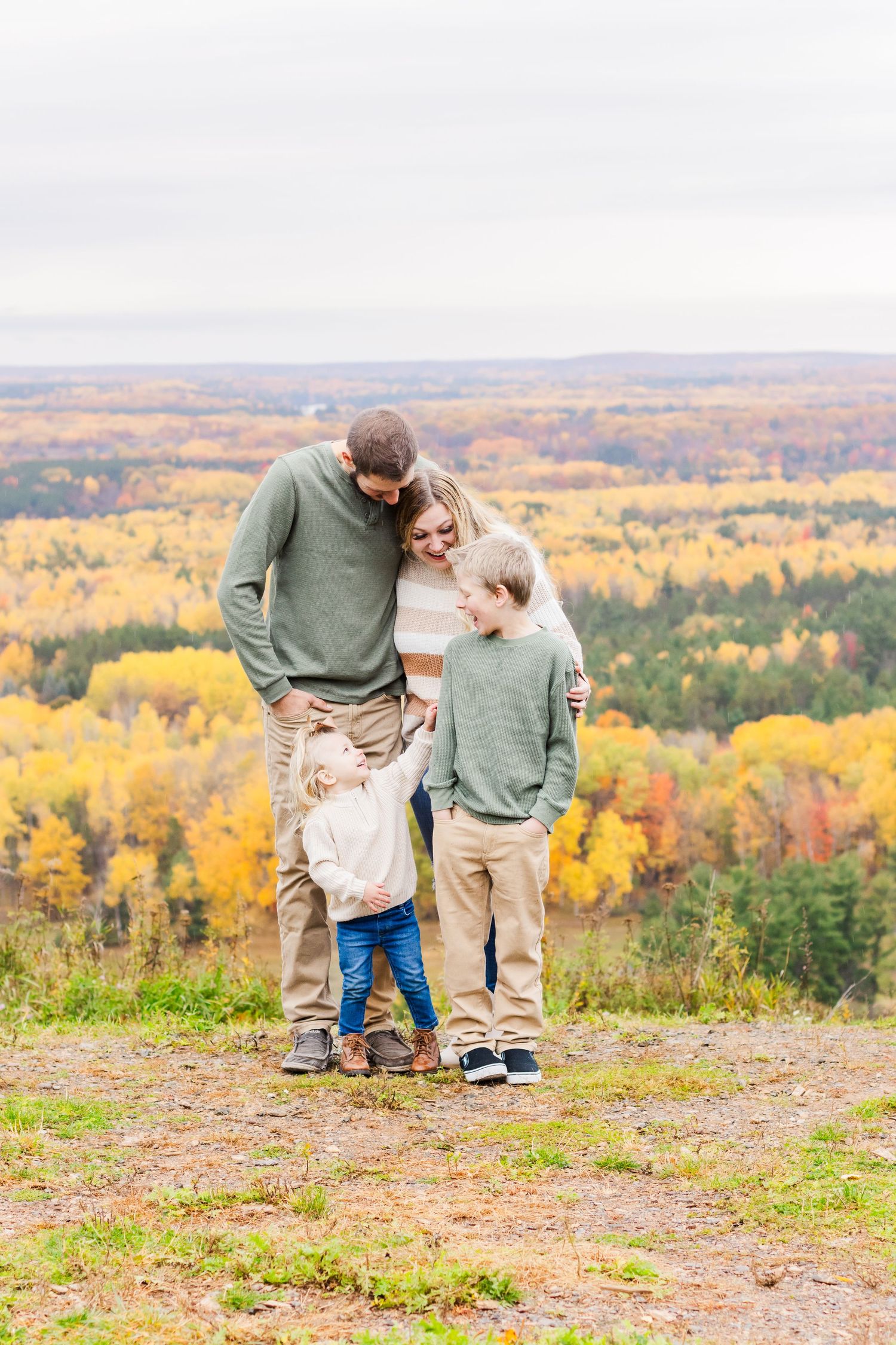
Avoid busy patterns
Busy patterns distract from what's really important in your pictures... you! Small, close together, and repeating patterns can create an effect called moiré, this effect will cause your piece of clothing to look "wavy" and become the center of attention in your photo. Ribbed shirts and dresses where the ribbing is very close together can even create this effect, so it's best to avoid this type of clothing. This doesn't mean you have to completely write off patterns, they can be a great addition to your outfit when using patterns such as large stripes, simple floral designs, and spaced out/large plaid.
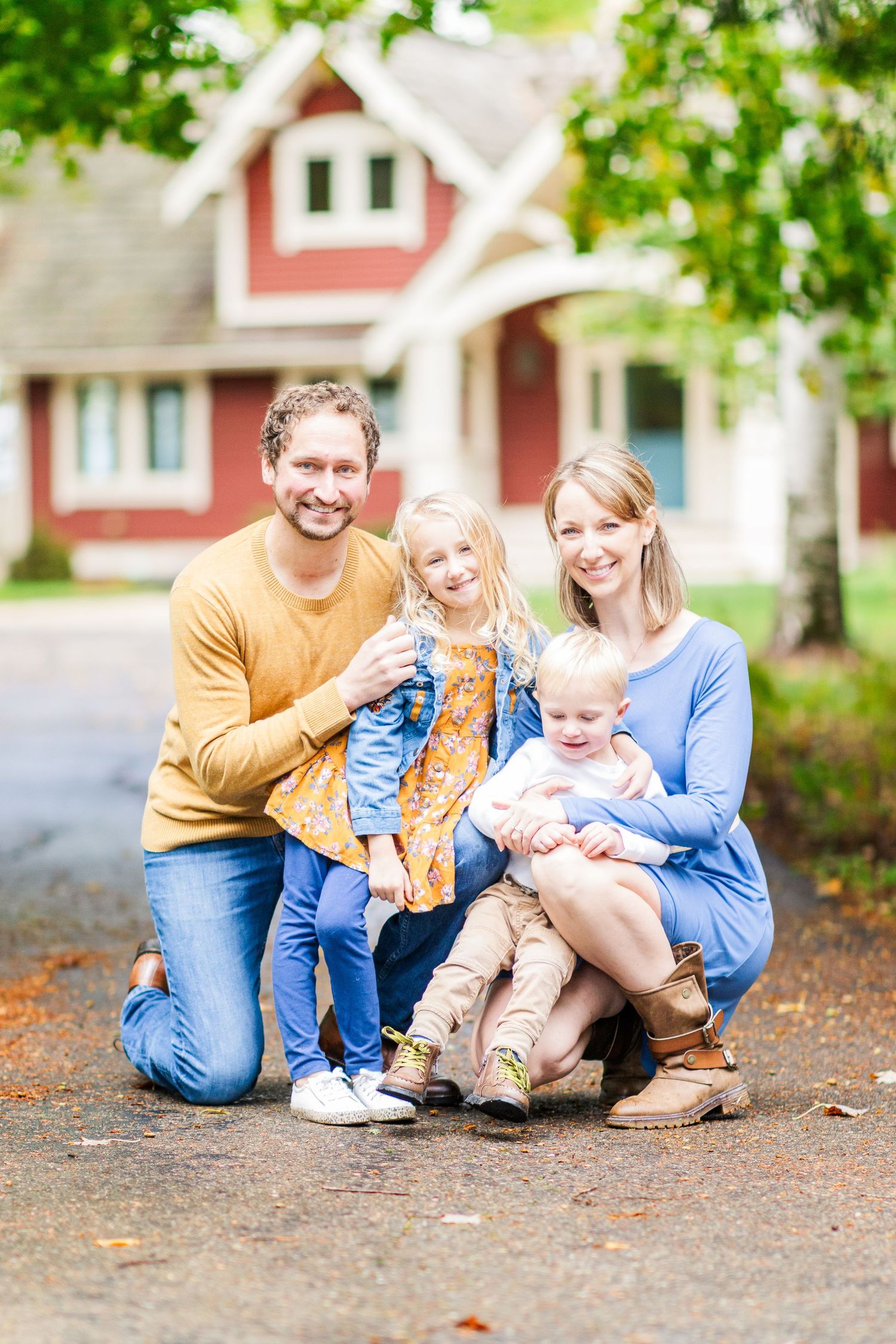
Don't match; coordinate
While it may be tempting to dress everyone in white shirts and jeans for a session, your photos will always look best with some variety in clothing/colors. Having each person wear a different color (as long as they complement each other) gives enough variety while still pulling everyone together in the photo. You can coordinate outfits by having each family member wear a piece of clothing that contains a common color (such as light brown shoes, khaki pants, light brown dress, etc.). Having each family member wear a different shade of a common color works, too!
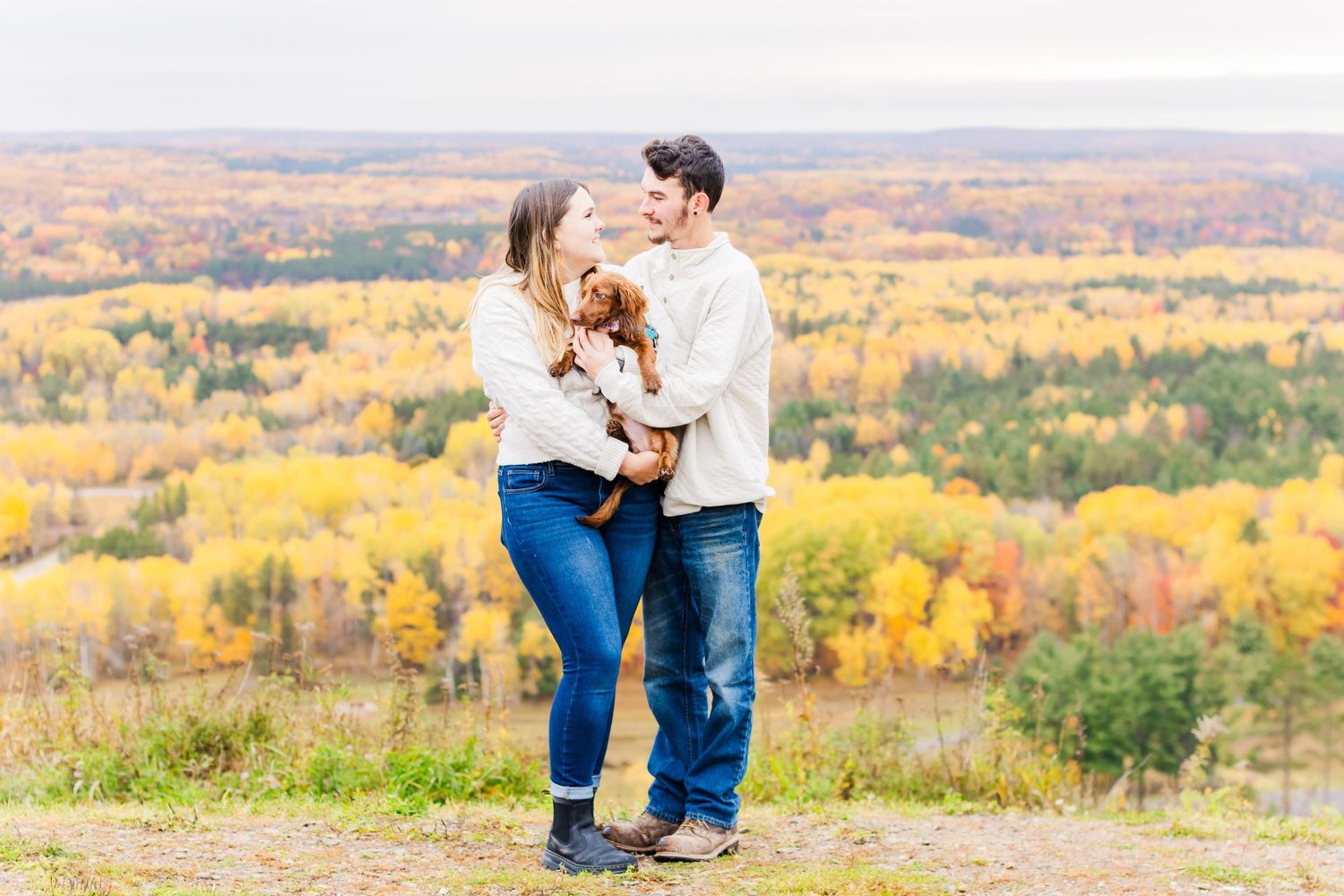
Stress doesn't go with any outfit
The most important part of dressing for your photo session is wearing clothes that you are comfortable in. Wear something you feel confident in, will be able to move around in, and will look back at through your photos and think, "I look great!" When you feel confident in what you're wearing, you'll look confident in your photos and love the outcome of your session even more.
Didn't want to read all of that? That's okay! Here are the takeaways:
What to avoid:
- black (use carefully)
- bright blue
- bright white
- bright red
- neon
- small, close together, and/or repetitive patterns (even ribbed clothing can give moiré)
- Matching outfits
Safe choices:
- neutral colors
- earth tones
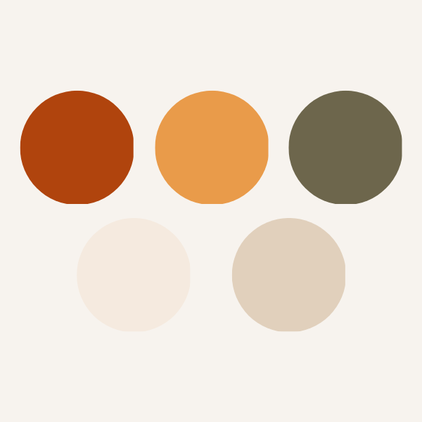
- choosing a neutral/earth tone color palette and coordinating outfits based on it
How to make YOU the center of attention in your photos:
- dress comfortably and confidently
- add a small pop of color to your photos by sparingly using a "fun" color (yellow, light blue, pink, etc.)
- coordinate outfits, don't be afraid to mismatch
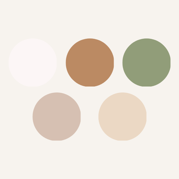
Need examples? Here are some color palettes that look great in photos!




The Process
01.
Check out my work
Review my portfolio through my website, Facebook, or Instagram. While you're at it, be sure to review my pricing.
02.
Reach out
Send me a message through email, my contact form, Facebook, etc. Let's talk about what you're envisioning for your session and how we can achieve it.
03.
Complete your booking
Confirm your date, sign your contract, and pay a session retainer to complete your booking. Ask me any questions leading up to your session!
04.
Show up!
Be there or be square, it's time to smile! Expect your photos back between 2-3 weeks for a regular session and 4-5 weeks for an event (such as a wedding). Keep a look out for those sneak peeks, too!